Project 321
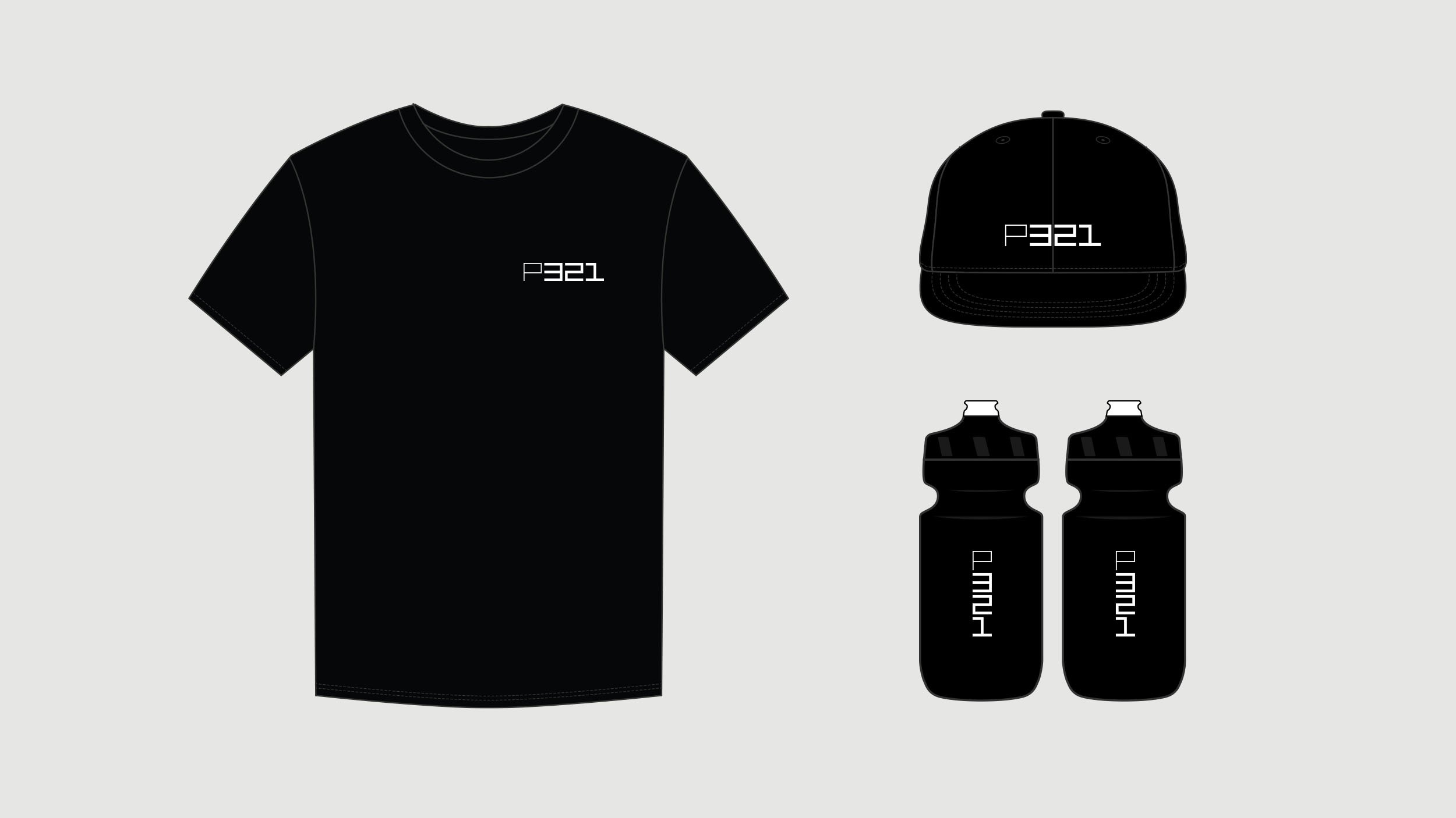
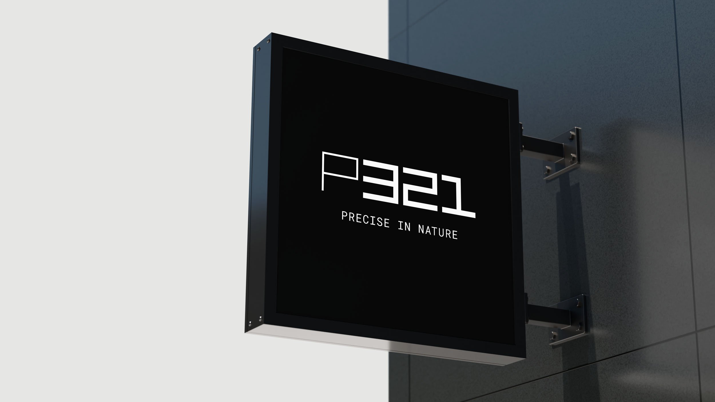
When Project 321 sold and moved to Canada, they reached out for a brand refresh to mark the next phase for the company. The identity design we created focuses on a series of perfect squares, with each character being expertly engineered within, allowing the P321 logo to be stacked and organized in multiple ways based on the various use cases, with a focus on hubs. We decided that the P321 was iconic enough on its own so we refrained from including an additional brand mark outside of the various P321 lockups.
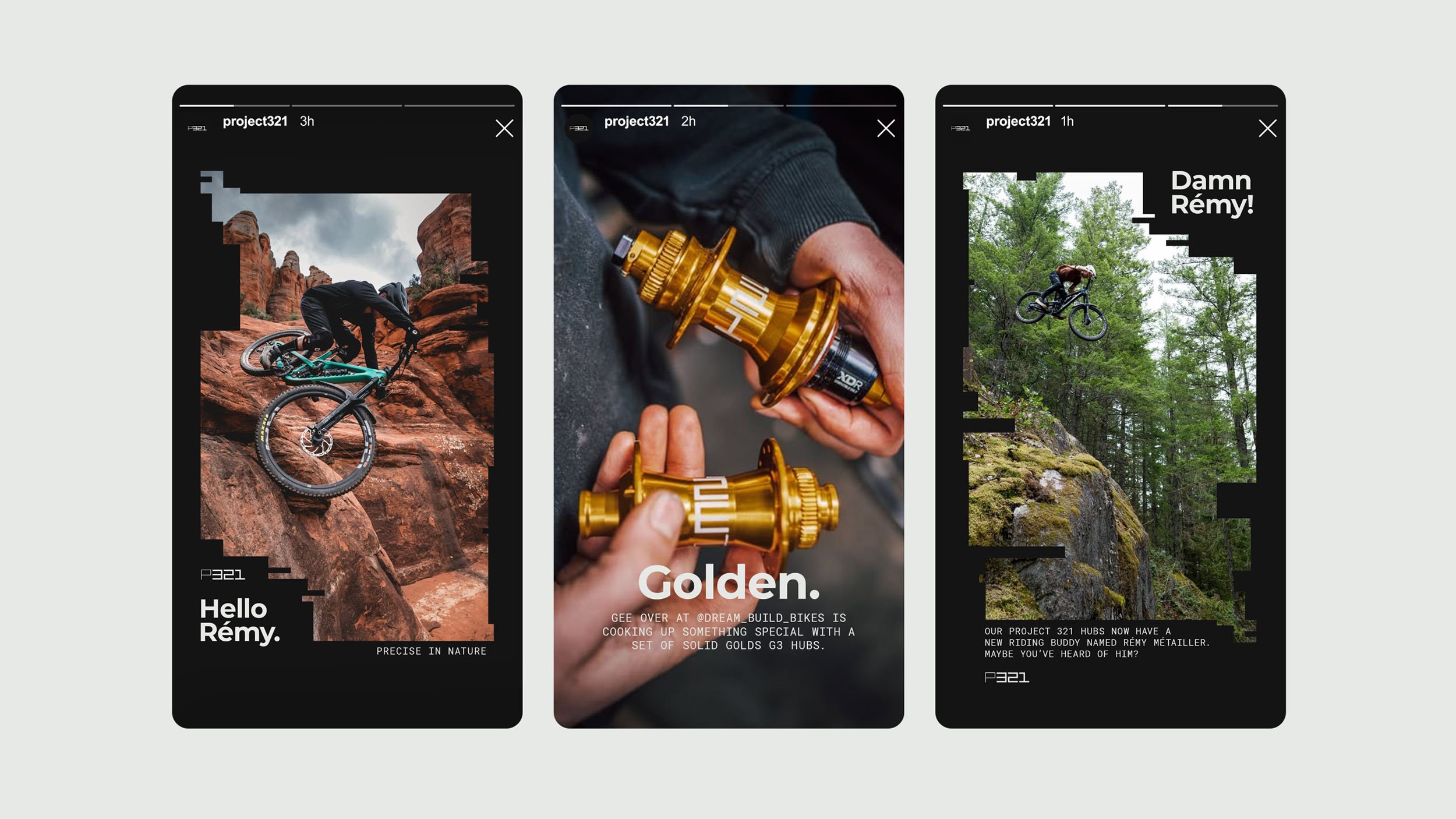
BRAND IDENTITY, TRADESHOW, WEBSITE, PRODUCT GRAPHICS